
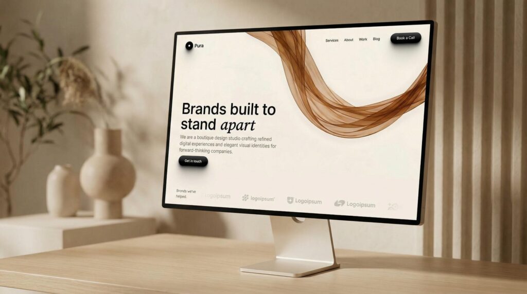
A business website is often the first interaction a potential customer has with a brand. Before speaking to your team, reviewing your proposal, or exploring your services, visitors are already forming an opinion about your business based on what they see on the screen.
Within seconds, they may begin evaluating your professionalism, credibility, attention to detail, and the quality of the services you provide.
But what makes one website feel premium while another looks ordinary, even when both offer similar services?
The answer isn’t necessarily expensive animations, complicated layouts, or extravagant visual effects. A premium website is the result of thoughtful design decisions, consistent branding, intuitive user experience, strong content, and technical execution.
At Adpixxels, we believe a premium business website should do more than look impressive. It should communicate value, build trust, and make it easier for potential customers to take the next step.
Let’s explore the essential elements that make a business website feel genuinely premium.
1. A Clear and Confident Visual Identity

The first thing visitors notice is the overall visual presentation. A premium website feels intentional. Every color, font, image, and spacing decision contributes to a consistent brand identity.
Businesses sometimes try to make their websites look expensive by adding more colors, decorative elements, gradients, shadows, and animations. However, too many competing elements can make a website feel cluttered rather than sophisticated.
Premium design often relies on restraint.
A strong visual identity typically includes:
- A deliberate color palette: Two or three primary brand colors supported by complementary neutral shades.
- Consistent typography: Carefully selected fonts that communicate the brand’s personality and remain readable across devices.
- A recognizable design language: Consistent buttons, borders, icons, image treatments, and interface elements.
- Visual consistency: A cohesive experience across the homepage, service pages, portfolio, and contact page.
For example, a premium consulting firm might use deep navy, warm white, elegant typography, and subtle motion. A contemporary fashion brand might choose expressive editorial layouts, striking photography, and generous white space.
Neither approach is inherently more premium. The design must match the business, its audience, and the expectations of its market.
2. Strategic Use of White Space
One of the most overlooked aspects of premium website design is empty space.
White space, also called negative space, refers to the areas around text, images, buttons, and other elements. Despite the name, it doesn’t have to be white.
Effective spacing helps visitors understand the relationship between different elements. It separates important information, improves readability, and allows key messages to stand out.
Consider two business websites.
The first places a headline, three paragraphs, six buttons, multiple icons, and several promotional banners into one section.
The second presents a clear headline, a concise supporting statement, one prominent call to action, and a carefully selected visual.
The second layout will often feel more polished because it gives visitors a clear visual hierarchy.
White space also communicates confidence. A business doesn’t need to display every detail simultaneously to demonstrate its value.
The goal is not to leave the website empty. It’s to give every element enough room to serve its purpose.
3. Typography That Communicates Quality
Typography influences how visitors perceive a brand before they have read the full message.
A premium website uses fonts that complement its positioning while making the content easy to scan.
For most business websites, a practical typography system includes:
- A distinctive but readable heading font.
- A clean body font designed for comfortable reading.
- A consistent hierarchy for H1, H2, and H3 headings.
- Appropriate line spacing and paragraph widths.
- Consistent font weights and sizes across similar elements.
The main headline deserves particular attention. It should be prominent enough to establish the page’s focus without overwhelming the rest of the layout.
For example, compare these two headlines:
We Provide Website Design and Development Services.
Digital Experiences Built for Ambitious Businesses.
The second headline communicates positioning and ambition rather than simply listing a service. When supported by clear explanatory copy, it can help a brand feel more distinctive.
However, sophisticated typography cannot compensate for vague messaging. The content must still explain what the business does, whom it serves, and why a potential customer should care.
4. High-Quality Images and Meaningful Visuals

Visuals play a major role in shaping a website’s perceived quality.
Low-resolution images, unrelated stock photography, inconsistent image proportions, and poorly cropped visuals can undermine an otherwise well-designed website.
Premium websites typically use visuals with a clear purpose. They might demonstrate a product, communicate a brand’s personality, illustrate a service, or show evidence of previous work.
For service businesses, authentic portfolio images and relevant project screenshots can be particularly valuable. They help potential customers understand the quality of the work rather than relying entirely on marketing claims.
To improve visual quality:
- Use high-resolution images with consistent art direction.
- Maintain predictable aspect ratios within repeated layouts.
- Choose images that reflect the intended customer and market.
- Avoid generic stock photography when genuine project imagery is available.
- Optimize image sizes and formats to protect loading performance.
- Use appropriate cropping and positioning across desktop and mobile layouts.
For an ecommerce brand, detailed product photography can help communicate materials, quality, and craftsmanship. For a professional services company, real team photographs, project imagery, and client-approved case studies may establish greater credibility.
The best visuals are not necessarily the most expensive. They are the ones that make the brand and its offering easier to understand.
5. A Homepage That Communicates Value Immediately
Your homepage should answer three essential questions:
- What does your business do?
- Who do you help?
- What should visitors do next?
If visitors cannot answer these questions quickly, even a visually impressive website may struggle to generate qualified enquiries.
A strong homepage generally includes a clear headline, supporting copy, a relevant visual, and a primary call to action.
For example, a website development agency might use the following structure:
Headline: High-Performance Websites for Ambitious Businesses
Supporting copy: We design and develop fast, conversion-focused websites that help businesses strengthen their online presence and create better customer experiences.
Primary CTA: Discuss Your Project
This structure establishes the service, communicates a benefit, and gives visitors a clear next step.
The remainder of the homepage can then build confidence through services, selected projects, case studies, the development process, testimonials, and frequently asked questions.
A premium website doesn’t force visitors to figure out what the business offers. It makes the value proposition immediately understandable.
6. Subtle Animations and Thoughtful Interactions
Animations can make a website feel modern and responsive when they support the experience rather than distract from it.
Subtle transitions, gentle image reveals, carefully timed hover effects, and smooth navigation feedback can add polish to a well-designed interface.
The key is restraint.
Useful animation examples include:
- A subtle button transition when hovered over.
- A controlled image reveal as a section enters the viewport.
- A smooth expansion of an accordion.
- A gentle transition between navigation states.
- A refined loading experience that doesn’t delay access to content.
Problems arise when animations become the main attraction. Excessive parallax, long preloader sequences, constantly moving backgrounds, and unnecessary cursor effects can make a site frustrating to use.
Animations should also respect accessibility preferences, including reduced-motion settings, and should not prevent users from accessing important content.
A premium interaction feels natural. Visitors notice how smooth the experience is, not how hard the website is trying to impress them.
7. Mobile Experience That Feels Equally Refined

A website that looks excellent on a desktop but feels awkward on a smartphone does not deliver a complete premium experience.
Visitors may arrive from Google, LinkedIn, Instagram, email campaigns, or direct links. Many will use mobile devices, so the website must adapt to different screen sizes and interaction patterns.
A refined mobile experience includes:
- Readable typography without excessive zooming.
- Clear navigation and appropriately sized touch targets.
- Images that fit the screen without awkward cropping.
- Forms that are simple to complete.
- Buttons that are easy to find and use.
- Content that maintains a logical reading order.
- Fast and stable page loading.
Mobile optimization should not simply stack desktop elements vertically. It should reconsider how information is presented on smaller screens.
For example, a multi-column portfolio layout might become a single-column list with larger project images. A complex desktop navigation menu might become a simpler mobile menu with clear categories.
Testing on actual mobile devices helps reveal usability issues that can be missed in a desktop preview.
8. Website Speed and Technical Quality
Visual design creates the initial impression, but technical performance influences whether the experience remains enjoyable.
A premium website should load efficiently, respond reliably, and avoid unexpected layout shifts.
Google’s Core Web Vitals provide useful measures of user experience:
| Metric | What it measures | Good target |
|---|---|---|
| LCP | Loading performance | ≤ 2.5 seconds |
| INP | Interaction responsiveness | ≤ 200 milliseconds |
| CLS | Visual stability | ≤ 0.1 |
These thresholds are assessed at the 75th percentile of real user visits, segmented by mobile and desktop. They are useful performance goals, not guarantees of search rankings or conversions.
Common technical improvements include optimizing images, reducing unnecessary scripts, minimizing excessive plugin usage, implementing caching appropriately, and loading third-party resources carefully.
A website should also have reliable forms, functional navigation, secure HTTPS, accessible error messages, and a properly configured checkout or enquiry process.
A beautifully designed contact button is of little value if the form fails to send enquiries.
9. Content That Demonstrates Expertise and Builds Trust
Premium positioning is not established by design alone. Visitors also evaluate the substance behind the presentation.
Generic statements such as “We deliver innovative solutions” or “We are the best in the industry” offer little evidence of expertise.
Stronger content explains the business’s approach, demonstrates its understanding of customer problems, and provides meaningful evidence to support its claims.
Useful trust-building elements include:
- Detailed case studies describing challenges, decisions, and outcomes.
- Authentic client testimonials.
- Relevant certifications or professional credentials.
- Clear explanations of services and deliverables.
- Transparent contact information and business policies.
- Helpful articles that answer questions potential customers actually ask.
Case studies are especially useful for service businesses because they connect capabilities with real project work.
For example, instead of claiming to build high-performing ecommerce websites, an agency can explain how it organized a product catalog, improved navigation, addressed mobile usability, and measured checkout behavior for a specific project.
When results are available, quantified evidence can make the story stronger. Claims should always be accurate and supported by verifiable information.
10. Conversion-Focused Design Without Aggressive Selling
A premium website should guide visitors toward a meaningful action without making them feel pressured.
This requires a deliberate conversion strategy.
For a service business, the desired action might be booking a consultation, requesting a proposal, or submitting a project enquiry. For an ecommerce store, it might be viewing a product, adding it to the cart, or completing checkout.
The design should make these actions easy to identify.
Effective conversion practices include:
- Using descriptive calls to action.
- Placing relevant CTAs near important decision points.
- Removing unnecessary form fields.
- Explaining what happens after a visitor submits an enquiry.
- Addressing common objections through FAQs and supporting content.
- Providing appropriate trust signals near conversion points.
- Measuring user behavior and testing improvements.
Avoid overwhelming visitors with competing buttons, intrusive pop-ups, or artificial urgency.
A premium experience respects the customer’s decision-making process. It provides the information needed to take the next step with confidence.
11. Consistency Across Every Page
A homepage may look excellent, but the overall brand experience can deteriorate if the remaining pages use inconsistent styles, layouts, and messaging.
A premium website should feel like one connected system.
Service pages should follow a consistent structure. Buttons should behave predictably. Heading styles should remain recognizable. Portfolio projects should use a cohesive presentation, and the footer should provide useful navigation and contact information.
This is where a reusable design system becomes valuable.
Defining colors, typography, spacing, buttons, form styles, cards, and responsive behavior makes it easier to maintain consistency as the website grows.
It can also simplify future updates because new pages can be created using established patterns rather than redesigned from scratch.
Consistency communicates attention to detail, and attention to detail contributes significantly to perceived quality.
Conclusion: Premium Is About the Entire Experience
A premium business website is not defined by a black background, an expensive-looking font, cinematic animations, or a minimalist homepage.
It is defined by how effectively every part of the experience works together.
The visual identity establishes the first impression. Typography and spacing make information easier to understand. High-quality visuals communicate value. Clear messaging explains the offering. Responsive layouts support mobile visitors. Technical performance keeps the experience smooth, while credible content and thoughtful conversion design help build trust.
When these elements work together, the website becomes more than a digital brochure. It becomes a meaningful part of the business’s brand positioning and customer acquisition strategy.
At Adpixxels, we approach website development with this principle in mind: a premium website should not simply look expensive; it should make the business feel credible, communicate value clearly, and help customers take action.
If your business is ready to improve its online presence, explore Adpixxels to learn more about our website design and development services.